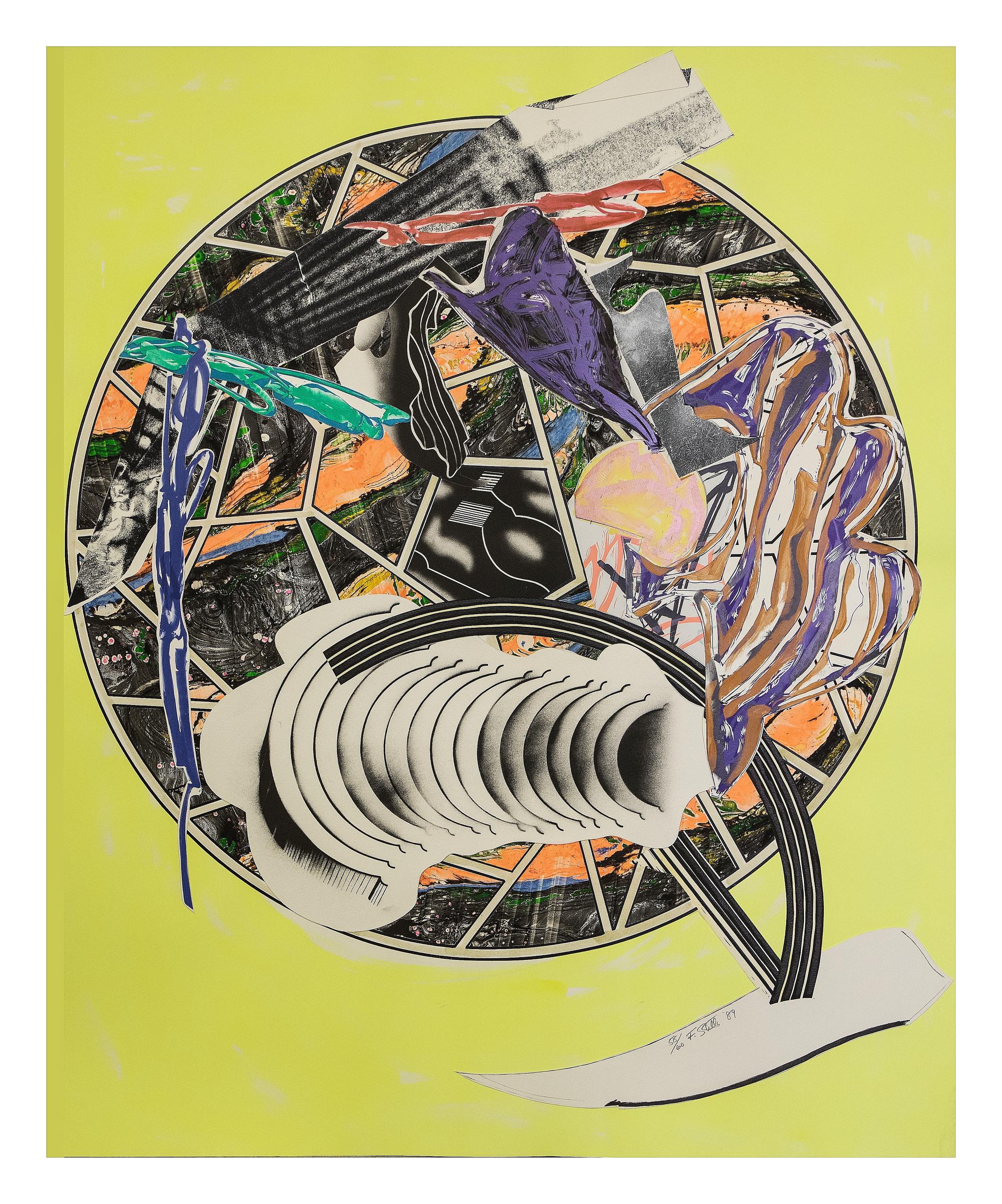
Frank Stella (B. 1936) The Whale as a Dish
Lotto 757
25 00035 000
Silkscreen, litograph, colour linocut, marbled, hand-coloured, collage on paper
Edition 58/60
171 x 139
Executed in 1989
Frank Stella
The Waves
From 1985 until 1997 Frank Stella worked on one of his most important series, creating over 200 works with titles based on the chapters of Moby Dick, Herman Melville's nineteenth century novel. This series includes works across various mediums, from prints to reliefs and sculptures, and also contains smaller series. The first of these smaller series was The Waves (1985-1989), a series of 13 printsthat display Stella's creativity and technical understanding of prints. Each image was created in an edition of 60 with 10 artist proofs and 4 printer's proofs. They utilise a variety of techniques including lithography, linoleum block printing, marbling, hand-colouring and collage, and required a complicated series of runs and overlays to achieve their end results. Throughout this series certain motifs keep reappearing, namely the namesake wave shapes, some whale-like shapes, and also lattice shapes that help to hold these complicated compositions together. In fact, for each image in the series Stella selected a specific lattice pattern fromthe twelve hundred that Daniel Sheets Dye classified in A Grammar of ChineseLattice. Stella spent a long time working on these prints, which took four years to complete, and the imagery that appear in them clearly play a role in other works in the Moby-Dick series.
The Waves were always intended as a part of a much larger project that wouldinclude a range of formats. Moby-Dick was important for Stella, who knew from the very start that he would create at least one work for every chapter in the novel (all 135 main chapters plus «Etymology», «Extracts», and «Epilogue»). It has often been noted that Moby Dick was a novel that interested many Abstract Ex-pressionist painters, including Jackson Pollock, whose 1943 painting Paiphaë was originally called Moby Dick, and who also created a smaller gouache called Blue (Moby Dick) (1943). Indeed, through his Moby-Dick works Stella can be seen to be exploring ideas around abstraction, figuration and perception in ways thatdiffer dramatically from his earlier, minimalist series of Black Paintings from the late 1950s. In a 2001 interview, Stella described his Moby-Dick series as both a response and a tribute to the abstract expressionists. «They’re still the generation I admire. This is paying my debt, or not so much paying my debt as expressing my admiration for the abstract expressionist generation that I grew up with and that I admired the most, and that I still admire.» However, Stella did not simply rehash old ideas, but looked to move abstraction forwards, saying «Abstraction in the 20th century is dependent on cubism, which is arranging planes in space, but the planes are arranged in a kind of stiff and geometric kind of way [...] Once the planes begin to bend and curve and deform then you get into what happens in Moby Dick - it’s a way of opening things up for abstraction.» This image takes its title from the 65th chapter of Moby Dick, where Ahab, perhaps recognising that it was no longer common practice, discusses why eating whale meat is morally no different than eating any other type of animal. In this work chaos appears to be mostly (but not entirely) contained in a central circle, with a bright yellow background. A lattice pattern is still detectable in the white lines within the circle, from which an almost tail-like shape seems to have escaped.